Tableau Project
Data Description
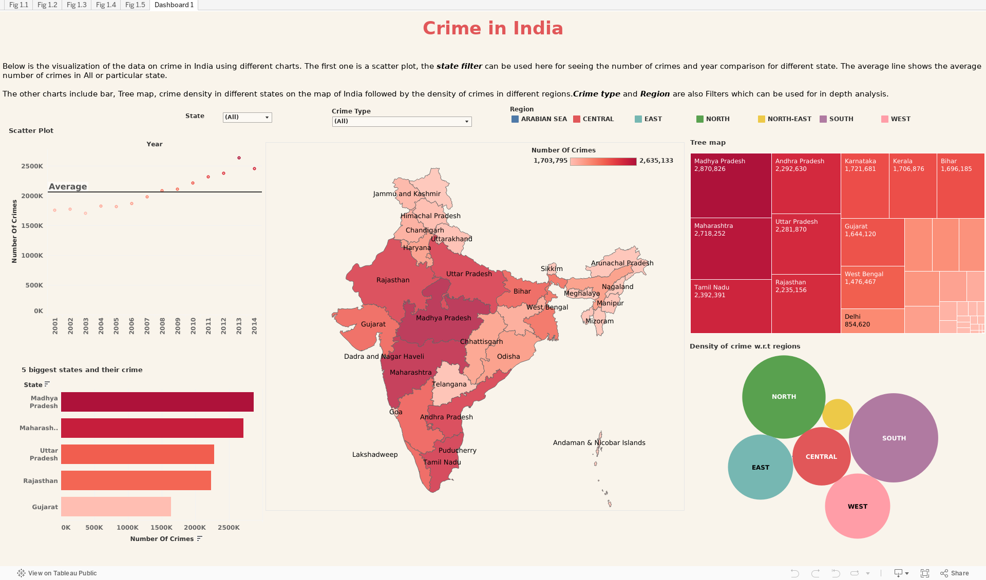
The data used for the analysis is of crimes in different states in India from 2001 to 2013. The above table explains all of the variables in the data well. The data consists of 2,03,908 rows and above mentioned 7 fields.
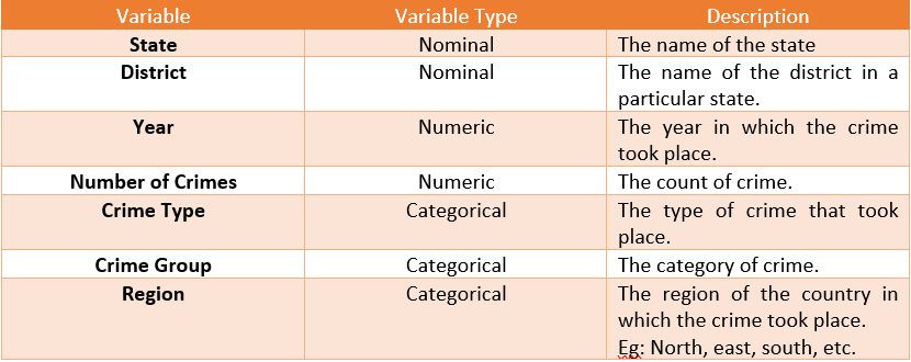
Scatter Plot
Above is a scatter plot where we have plotted Number of crimes on the Y axis and Year on the X axis. We can see that the number of crimes have increased over the years in the country. There is an exponential jump in this number from 2012 to 2013. There is a filter provided to see the relation of year with number of crime for each state.
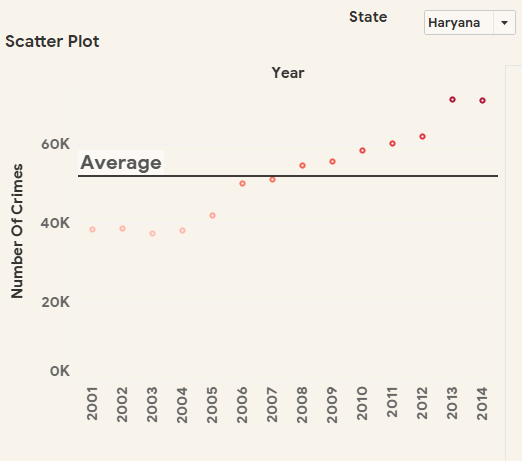
Tree map
The tree map consists of the state and the number of crimes in each of them in a hierarchical structure where larger the size of the rectangle more are the number of crimes committed in a state over 2001 – 2014. We can use the filter provided to select the crime type for analysis of each state.
Packed bubbles
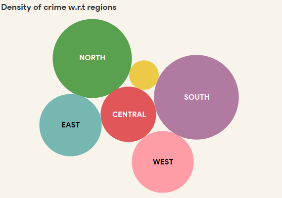
The Circles represent the different regions such as north, central, east, north-east, west, south, Arabian sea. The size of the circle represents the region of the country with the number of crimes for each type of crime in the data. We can find in which region we have the maximum density of crime.
Crime density map
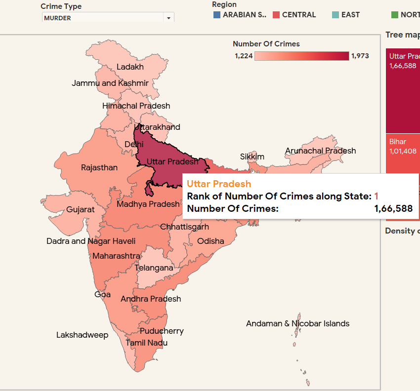
It is a map of India generated using the data in tableau where we use color design principles to represent the density of a type of crime in different states. The base color used is red. Darker the color more is the number of crime in that state. In the above image we have hovered over Uttar Pradesh and it shows that UP is Ranked Number 1 for Murder. We can do this for other crimes as well as for other states.
Comparison between the 5 biggest states using bar graph
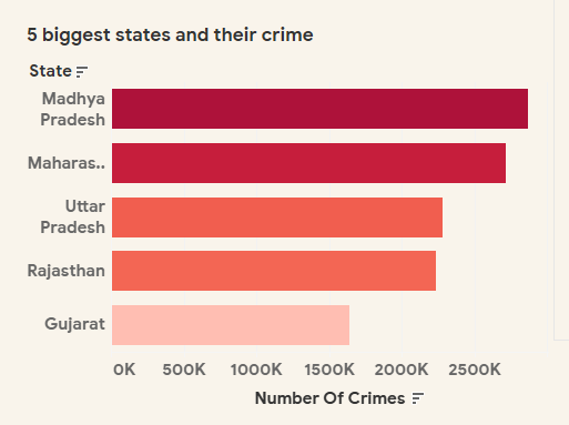
Finally here we compare the crime in the 5 biggest states of India over the years 2001-2014. The horizontal bar-graph is plotted for state name on Y axis and Number of crime on the Y axis.